Browse Author by Hua
Cheat Sheets
Scientists Discover How Meditation Changes the Brain | Big Think
Meditation is not only a good way to beat the stress but it actually changes the brains of its practitioners. The specific kind of changes depend on the type of meditation you practice, conclude new studies from the Max Planck Institute of Human Cognitive and Brain Sciences in Germany.
“You can’t come up with one woman?” – Insight Data
Are there women on the interview panel? Are there tampons in the women’s bathroom?
Your Birth Month Can Determine What Diseases You’ll Likely Develop | Big Think
Forget your zodiac sign, but do mind when you were born. It does say something about you, after all. Researchers at Columbia University Medical Center (CUMC) came across an astonishing discovery recently. Your birth month and specifically what season you were born in, may tell you what diseases you’re more likely to have.
Algorithms for Climate Data Sonification
Introduction
Data visualization is the most commonly used approach to analyze and present data. However, patterns, anomalies, or relationships between variables in large and complex datasets may not show up clearly in even the most sophisticated graph. For example, climate time series such as daily temperature data contain information on long-term trends, seasonal variation, localized weather events, and possible measurement or recording errors. It is difficult to design graphs that adequately represent all of these features. My goal of this project is to use sonification to highlight these different features in the dataset to enhance simultaneous graphical explorations.
With the help of my advisor Dr. Mark Greenwood and Dr. Stephen Durbin, I produced a sonification of Bozeman climate data using R shiny. The feedbacks from Dr. Stacey Hancock and my colleagues in Statistical Consulting and Research Services center helped me modify the sonification. In this blog, I will briefly describe the process and the tools that I used for this project.
Data preparation and trend modeling
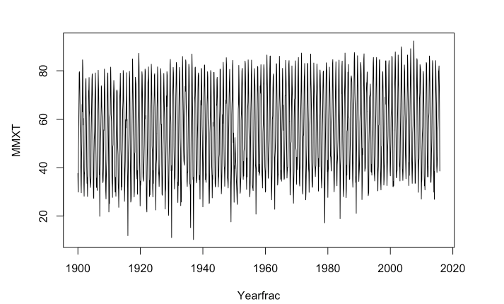
The dataset that I used for this project is Bozeman maximum monthly temperature from January 1900 to November 2015, which consists of four variables (station, station name, date and maximum monthly temperature). As we can see from Figure 1, there are a few missing months.
I used ts (time series) function in R to complete the year fraction of each month in the dataset, other data manipulations can be found in my code. Then I used a generalized additive model to fit a model for the trends of the temperature. Generalized additive model is a method that describes the relationship between a univariate response variable, for example, maximum monthly temperature and some predictor variables such as yearly trends and monthly trends of temperature using smooth functions. The model is stated as below:
g(E(MMXT)) = ß0 + f1(YearlyTrend) + f2(MonthlyTrend) + Residuals.
I used the mgcv package in R to build this model, and it explains 93.6% of the deviances of the data. Here is the model summary:
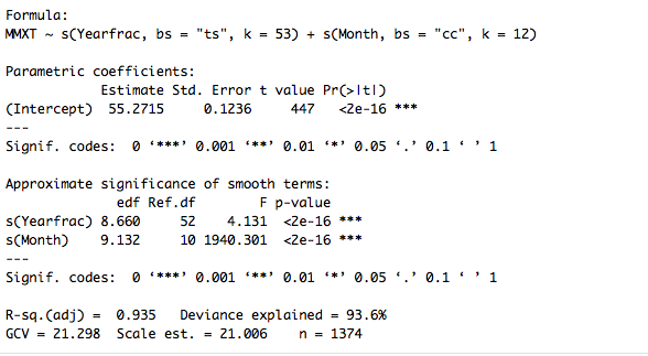
The plot of yearly trends and monthly trends below (Figure 3) suggests that overall, the temperature is estimated to increase by about 4 Fahrenheit degrees over last 115 years, and there continues an increasing trend for the temperature in Bozeman. The monthly trends show that there is a seasonal pattern in the temperature in the data.

Along with long-term trend and seasonal components in the model, I also included the residuals from the model. After building this model, I created a data frame using the values of the model and make it ready for data sonification.
Sonify data
My first approach is to find some R sonification packages and try to build my own sonification package in R. During this process, I found audiolyzeR, sonify, and audio packages in R. These packages can sonify the data, and some sound parameters can be changed in the functions, however, none of them can synthesize different sounds.
After consulting with Dr. Stephen Durbin, I decided to use web audio API to sonify the data. In order to visualize the data while playing the sound, I created R shiny app to show the yearly trends, monthly trends and residuals while the data are sonified. In order to sonify these sounds, I first linearly transformed the yearly trends, monthly trends and residuals into frequencies. I made three different ranges of the frequencies of these three different components of temperature in order to make the sounds of each component distinct from each other, and they are all in one octave.
The monthly trend has the lowest frequency (220 to 440 Hz) because the seasonal trends are pretty constant and systematic, whereas the residuals have the highest frequency (1046.50 to 2093.00 Hz) because of more rapid and frequent changes. The yearly trends have the middle range from 493.88 to 987.77 Hz. Then I used three different instruments to play these three components: grand piano for monthly trend, alto flute for yearly trend and harp for residuals. The audio file of the data sonification can be found here:
The R shiny app is still in the developing process because I want to add more features. However, the data, R code, R shiny app code can be found on my GitHub page.
Seattle


)")


Protected: 西雅图:一个人的旅行
Plot
Study & Analysis of Household WiFi Speed
I conducted a balanced three-factor factorial study to test the main effects of obstacles, a number of WiFi users, the distance between WiFi router and WiFi users, as well as the potential effects of interactions among these three variables on WiFi speed. Then I used SAS to analyze the data.
Full Article: PDF
Presentation: PPT
Code: GitHub